My wife needs my help, but I don’t think I can do this for her by myself.
Although through our @TweetSmarter account I’ve helped thousands of people over the last 5 years on Twitter, now I need some help myself. And I’d like to have my work for her done by Valentines day 🙂
Here’s the deal: My wife’s main source of income is her website, but it’s in trouble.
It needs to be updated, and to do that, it needs a new logo. I had designed one, but it turned out to be too similar to something Google (and others) had done. So I needed something completely different. Here’s my first draft of a new one:
(Yes…sigh…I misspelled “Resources”—will update shortly.)
I wanted to include a symbol of the business, and the microphone is more representative of performance than either a headset or mixer board. I wanted to get something else in, something about connection or sound, and I settled for the underline that suggests a microphone cord. And Sarah likes blue, so:
So: I’d really like your advice on this design! (I’ve included a note on branding below)
Colors
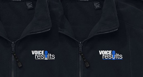
I’d also like to know how to use the colors, since Sarah also loves black fleece jackets. Would one of these be good?
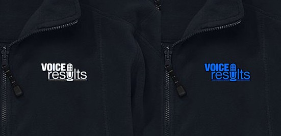
Or should it be something simpler? Such as:
Branding
As far as the brand goes, her company teaches people new to the industry how to perform as the voice on commercials, training videos, etc. She has nearly 30 years experience, and hires other coaches with similar experience.
She’s a terrific coach, having taught over 3,000 classes of one kind or another to date, and she personalizes it heavily in small groups…and makes it fun!
People travel some pretty long distances (to the Twin Cities, Minnesota) for the privilege of training with Sarah and the coaches she hires. Interested? Hit me up in the comments with some contact info, and I’ll have her get in touch with you…and get you a few hundred dollars in discounts too 🙂
(You can click here to leave a comment.)
Additional Versions
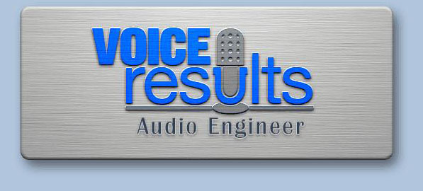
And here’s a kind of overly-photoshopped version to show how it could be used on a business card (it would only be a small portion of the card, not oversized like this):
 I’ve also experimented with making everything bolder, different blues, and using some gray/silver:Â
I’d really appreciate any and all comments you might have so I can help her get her new site online!
Why I’m (Still) Trying To Do It Myself
Basically, I’ve always enjoyed looking at good design, but felt inept at it. I eventually started playing around with Photoshop some years ago, and it’s been a fun hobby of mine every since.
Now, I think I’ve finally got the bare minimum skills to do a passable logo, and I love my wife (and saving money) and so I’d like to do this for Sarah…with a little bit of your help!
So…can you help me? Could you share this with anyone who might be able to help?
I’ll read, think about and respond to all comments!


When should you suspect heart failure lasix drip?
Non-specific Dope About this by-product
Excellent post. I was checking constantly this blog and I’m impressed!
Very useful information specially the last part 🙂 I
care for such info a lot. I was looking for this particular info for a long time.
Thank you and best of luck.
Feel free to surf to my web blog :: learn the facts here
Here is my site; paleo protein powder (Brayden)
Asking questions are actually good thing if you are not understanding anything totally, except this
piece of writing presents nice understanding even.
Also visit my site … natural black hairstyles
Hello! I realize this is sort of off-topic however I had to
ask. Does running a well-established website like yours take a large amount of work?
I’m completely new to blogging but I do write in my diary daily.
I’d like to start a blog so I can easily share
my experience and views online. Please let me know if you have any suggestions or tips for
brand new aspiring blog owners. Appreciate it!
My blog – short funky hairstyles
Amazing! This blog looks exactly like my old one! It’s on a entirely different topic but it has pretty much the same page
layout and design. Great choice of colors!
Feel free to visit my website – short haircuts
Well? What’s the final product? Did you get it done in time? Spill 😉
Great question! Still working on getting it done before the (technically midnight) deadline. I also sent her flowers to work, got her a travel mug she’d been wanting with the latest logo iteration on it, and woke her up with a flower, card and balloon 😉
Update: Sarah loves her travel mug, and she’s agreed to wait until this weekend for the final logo while I work on some other things that are also important to her 🙂
Hi Dave,
I like the logo with the blue mic and white lettering on the fleece. Nicely done on the logo!
Kyle
Thanks, Kyle. You have excellent taste 😉 (It’s my favorite also)
Hi, Dave – I think the blue-and-white example on the right-most of the two black jackets looks the less phallic. Having both the mike and the underline colored blue seems to be the trick – it turns that graphic into a unit. It also makes the “u” stand out. Consider using a mike that doesn’t reach to the top line of “VOICE” (shorter)
Suggestion: pick a font that is slightly less blocky … this feels very heavy. Consider using a lying down on its side mike as the bottom line — maybe have its cord “curl” a bit to give movement and maybe have the a little off the 180-degree line.
Great idea on the shorter mic, Kathy! I was just experimenting with that.
Also love the cord curl idea! I was trying a lot of things like that but never thought of just a simple curl.
True about the bit of heaviness. Kind of trapped myself by needing a font that makes a decent “u” for the mic. But I can definitely thin it all out a bit to lighten it up.
Cool idea about the bottom mic too! Hadn’t considered that, since when done that way it’s usually a symbol for music/singers…but I’ll experiment a bit 🙂
Hi Dave,
I finally know your name 🙂 This is so sweet of you to do.
Here is my take: I do like the blue, I especially like how it looks on the black fleece. I prefer how it looks in a single color, as opposed to the different color for the underline.
I don’t think blue is not feminine, after all she is reaching out to males and females, so it should be neutral.
I do agree that the logo should include something that references her video side of the business, it would atract the right kind of people.
I like the font also and the grey background.
Depending on what color you prefer the mic can be white or blue (so the opposite from the text), I really don’t dislike either one, they both look good on the fleece.
Good luck and have a wonderful Valentine’s Day. Your wife is a lucky lady 😀
Thanks, Patricia 🙂
There are a lot of potential things (such as video) that could be referenced, and as long as it looks good, I’m open to it!
Sarah also likes the single color 🙂
I recommend pixelpool (orlagh@pixelpool.ie)
Best of luck, Dave Cowley
Hello!
Overall, the logo is successful. The microphone clearly implies an audio-based organization. It does have a bit of a leaning effect, but it’s even on both sides.
I would only suggest a few small-scale changes:
1. Consider altering the selected blue to be a little more feminine. At the moment, it is leaning towards the generic Google link blue. Perhaps something a teensie bit lighter and leaning towards a blue-green or even a slight tinge of purple to add a feminine touch.
2. Use the same font for Audio Engineer and Classes & Resources and keep both centered and contained under the line.
3. If you split colors, keep the microphone all one color. Just coloring the top part makes it look kind of like… something else.
4. If it’s possible, adjust the font sizes or kerning between the letters so that all the type stays within the margins to avoid the leaning effect. Again, not totally necessary.
Hope this helps!!
Wow, Jenn—amazing observation on the illusory leaning effect. Never noticed that. Will investigate. I had been thinking of going “fatter” with the mic (as in the bottom logo) and that may fix it without further changes.
I had liked making the U (which is both text and mic) part of the microphone as you suggest, but was concerned that it then lost it’s function as the “u”…but I will reconsider. I never really gave it a chance. Maybe I can make it a slight mix of colors.
I have been leaning toward a greener, more “cornflower” blue (as in the last logo). I’ll keep on that direction!
I did like centering everything under the underline for the subheads, but wanted to try an overall centering as well. Will follow your suggestion to stick with the underline centering.
I definitely agree on keeping the subheads in the same font. They actually are, I’m just experimenting with different treatments.
I had avoided going higher up the hue scale into violets as I liked to keep things blueish for overall site colors, and lower luminosity colors get very purplish. But I hadn’t thought about the effect on branding. I’ll take another look at that.
Thanks for taking the time to share such awesome tips!
How sweet! You did a beautiful job with the logos. The white logo with the blue mike and white underline is very striking to the eye . Love it! 🙂
Thanks Lilly. That was the one I created to fix what seemed not to work with the blue underline one. Now I can’t decide between them :-))
Hello,
Nice logo! I like the one with the blue mic and the blue underline.
Awesome! Thanks, Elvira. I think yours might be the winning vote 🙂
Hi David,
I really love the logo design. Simple yet aestherically pleasing.
With regards to the jackets I like the first one. I think its suits the theme of the site best.
was there anything else?
Hope your wife likes it.
Ayath
@ayathullah
Thanks, Ayath! That seems to be the consensus. Really appreciate your taking the time to share your thoughts 🙂
Because Sarah deals with video as well,how about under top of the microphone in the “U” include a black square screen with “V” in the middle,in red! All the best!:)
I love your perspective on getting more out of the logo. I feel the same way myself. Have tried to pack a lot of things in over time.
Hadn’t considered video though. Thanks for the idea!
Dear Mr David,
One day I shall find a lovely husband who does nice things like this for me, which is why I feel impelled to reply.
Linda and Patricia speak sense, they have it sussed. The white logo with blue mic and underline (right black jacket) is the canines’s undercarriage. It’s fabulous, eye-catching, professional and.. Well… Perfect.
Not knowing much about the brand it’s hard, but working in the branding profession I’d say go for it.
Hope this has helped, much luck!
Cat x
Really appreciate your chiming in! I also like how the mic and underline combine together. It seems a little dark, so maybe I’ll just lighten the blue a bit. Hard to tell how it will look in real life.
And thanks for the tip! I’ve added some branding info to the post in a section called “Branding.”
That’s a clever answer to a tricky qeustoin
I would go with the White logo with the blue mike and white underline, on everything. It’s a great logo. Very clever.
Thanks, Patricia. I can always seem to come up with a clever idea or two, but making them look good is darned hard!
So that’s two votes for the White logo with the blue mike and white underline.
Much appreciated!
Hi David
How really insightful and thoughtful you are! I like the second business card with the silver and I like the blue and white logo. (The one on the left black jacket. It is easier to read.)
Good luck and have a wonderful Valentine’s Day!
What excellent taste you have 😉 …my thoughts also.
Thanks, Linda!