The long-term consequences of web design choices are difficult to foresee. This is the third in a four-part series on how to prepare websites to change and grow and still look and work great without a major redesign.
This guide is here to steer you in the direction of choices that will give you the greatest long-term flexibility for planning or redesigning your own website, whether you build it or outsource it to a developer to do for you.
Ever notice how the more things you are working on, the more cluttered and disorganized your desk gets? The same thing happens to websites. Add a lot of things to them and they become cluttered and disorganized. The  good news is: you CAN avoid this!
More valuable, not more cluttered
Your site or blog can be and feel like a richer and more valuable resource as you add new content and shift your priorities over time, all without a major redesign.
You can’t avoid having shifting priorities over time. Life is change. And you’ll always be adding things to your site—even if you’re not a blogger. But by following a few simple rules, you can design a site that lasts for years without a major redesign.
1. Consider having a mini-home page for each section of your site
â–º Â This is the page visitors will be taken to when they click one of your main navigation links. In a blog, this is often called a “category page.”
Do this instead of having lots of those drop-down or fly-out sublinks in your navigation if you have a lot of potential links in your site navigation.
This gives you greater flexibility to present and change the information on your site in a way that does what you want without breaking your design. (And you have the flexiblity to add sublinks to your navigation later.)
This does mean visitors will have to click once to see the category home page, and then again to be taken to the content in the category they want to see.
But besides flexibility for you, this also gives you the chance to provide greater clarity for your visitors. This is because it’s sometimes hard to figure out which sublink to click when there are a lot of choices. Put those choices on a page instead, and you have room for text and graphics that help them understand what those choices mean—and more of a chance for you to guide them to what you’d like them to find.
2. Plan a flexible table of contents
â–º Â This is also known as your navigation structure, or information architecture.
By creating a home page for each section/category of your site, you’ve effectively broken the problem of your site into several smaller chunks. This will also help you make room for the unexpected, and let the categories of your site blend into one another without confusing your visitors.
Don’t be afraid to list some pages in more than one section of your site. For example, if you have separate sections for both “classes” and “events” you could link to “calendar” under both sections.
3. Create multiple places to add new highlights and navigation
â–º Â This can be where the real magic happens 🙂
A flexible layout that allows for additional navigation and things you want to highlight lets you bring new ideas and information in without breaking the look and feel of your site. This will be the focus of this article, part three in this four-part series.
4. Use technology that allows you to make most changes yourself
â–º Â This sometimes devolves into the “tables vs. css” for layout. Don’t be an ideologue: Do what’s best for the short and the long-term reality of maintaining a website.
In a book written for web developers that I read recently, the well-known author makes a shocking admission: many of the sites he and developers he worked with were quickly dismantled because the clients could not make the necessary updates without badly breaking the design.
This is a travesty, and it is a widespread problem: Developers are rarely focused on the best interests of their clients. This is not insidious: developers are not managers, they are developers. 
Clients should ask what can and cannot be changed by them after the developer’s work is done.
Even if you as a client don’t want to make any changes yourself, it needs to be fairly easy to find someone other than your current developer who can make changes on your site. From the client’s point of view, the more flexibility that can be built into a design, the better. It lowers the long term cost and increases the short term ease of management. So the first thing a developer should show a client is a sample page that the client can update, before a contract is signed.
Developers:Â Undoubtedly, some sites are very, very complex, and need to be. But in my experience, too little thought is given to how future changes will be handled.
Most of the developers you will find will NOT be able to provide you a good interface or strategy for making changes yourself. Again, you don’t have to make the changes yourself, but the developer needs to demonstrate that you could. If they can’t demonstrate it, that means you could be buying a custom house of cards that will fall apart at the slightest change request.
Generic examples: A general overview
 None of the diagrams here are gospel. This is a generic overview, not hard and fast rules for where things are positioned on your webpage.
For example, I show both horizontal and vertical navigation on the same page. It’s just as common to use one or the other, but not both. But I want you to get a good general overview of the options available to you.
That said, the information here touches on some good practices for information layout, so you won’t be misled if you design a site around the ideas in the example diagrams below.
Plan flexible space into every webpage
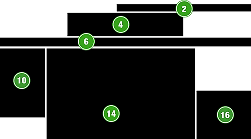
Let’s look at some of the typical fixed areas of a three-column website.
Your site may differ by shifting pieces left or right, or not using all pieces, but this help give you a starting point for visualizing the available real estate on a webpage:
- 2. Minor navigation
- 4. Logo area
- 6. Main horizontal navigation
- 10. Vertical navigation or highlights sidebar
- 14. Main content
- 16. Highlights/notices sidebar
The bottom portion, areas #10, #14 and #16, will continue down the page as needed to hold all your content; this is just the picture of a webpage before scrolling down.
The header: Logo and navigation
Notice the white space left and right of area #4, representing a centered logo.
That’s space you can use when you need it, labeled #3 and #5 in the diagram below. If your logo is flush left, you can think of the area to the right of a left-side logo as being area #3 and area #5 side-by-side.
If you put minor navigation on the top edge of your webpage (area #2 above), you can extend it as needed into area #1 (shown below). If you aren’t planning on using the top edge of your page above the logo at all, consider it space you can expand into later. You can also use area #1 to test making key information more visible, such as your phone number, member login box,urgent but temporary announcements, etc. 
While you could obviously use these areas to highlight temporary information of importance, you could also make area #3 and/or #5 a permanent part of your site navigation, such as to highlight testimonials, or a permanently rotating announcement of current events or specials, etc.
If you have a search box on your website (and you should) it should be in area #5. Alternate locations for displaying a search box include area #1 and some others, but #5 is best. But there are many other uses for these areas as well.
Something unexpected always happens eventually
Over time, many scenarios you did not foresee for adding information to your site will occur.
To take one drastic but not wholly uncommon example, say an important member of your website community dies. Area #3 or #5 can be used to show the notification and link to funeral arrangement information, and later to an obituary, before being removed after sufficient time passes.
The header’s “magic” spaces
The header of a webpage has a lot of flexibility. You have very little or no actual “content” here, and are dealing with a primarily gridlike layout of graphic elements.
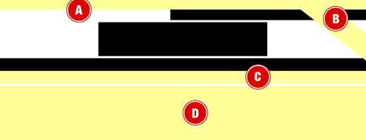
A great use of the upper edge that’s becoming more common is to place a post-it note colored thin yellow stripe, as shown in area #A below:
Area #B, the sales banner or corner peel back, can be added to almost any website design temporarily or permanently without breaking or significantly cluttering the design. Of course, the more special areas you make use of, the more potentially cluttered your website gets.
Area #C, just below the primary horizontal navigation but above the main content of the page is another great spot for a thin stripe in that yellow “reminder” color you can add information to permanently or temporarily.
For mega-attention, use area D: The “Three Buckets”
Area #D is the most overlooked opportunity on many websites.
Using this full-width area just below the horizontal navigation at the bottom of the page header pushes the main content down, so it must be used for an important purpose. A common approach is called the “Three Buckets.” (Click here to see examples of sites using this website navigation feature.)
This is where you can highlight 3 simple steps (“Find a Class, Sign up, Get Fit!”) or three benefits (“More Variety, Higher Quality, Lower Price”) or three key lists of information (“Gold Medalists, Silver Medalists, Bronze Medalists”) and so forth. Here is an example showing just the “three bucket” graphics for a charity referral website. This fits into area #D, and text links are added to each of the three boxes that linking to different parts of the site that fit into these three categories:
These three boxes grab HUGE attention, situated as they are just below the navigation but above the main content. Â (Obviously, if you don’t use this area, it just collapses. As always, any space not used disappears to make room for other elements.)
An all-page overview
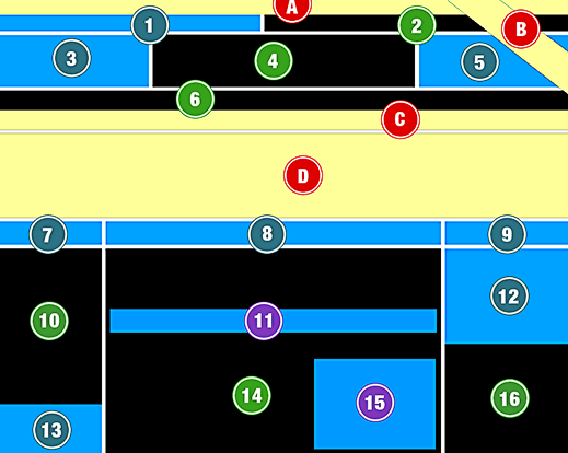
Here is a master diagram showing typical examples of an entire page. Realize that most of the non-black areas (primary content and design) will NOT be in use.
The green-labeled black boxes represent the most typically unchanging parts of the page; the colored areas are the most common changing parts. But, you can begin to use more and more of the optional spaces as part of your main design over time to give your site the flexibility it needs.
The red-labeled yellow areas are among the the most attention-getting areas. This a reference diagram you may want to click on and print out as a reference when looking for ways to add or alter information on your site in the future:
Now let’s look at the main content section of the webpage layout, areas #10 – #16.
The main content and sidebars
Here we see some of the common areas on the page where additions can be made below the header, and in and around your main content.
Note that area #12 and #16 simply constitute the right-hand sidebar of the page, but it is very common for the top part of this column to be one of the most changeable spots on a web page. Ads, popular/features content, special notices, etc: this spot is very flexible! 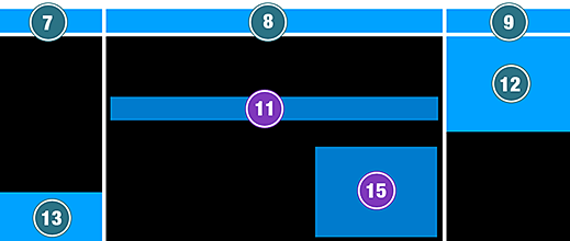
Remember, if you were for example to ONLY use area #8 for a temporary addition to the page, areas #7 and #9 would not be empty space, they would disappear, and the sidebars would “slide” up to fill that space.
Area #13 is simply additional space below what is usually (area #10) left-hand navigation links. This is a common spot for miscellaneous items for sale, such as books relevant to your site content.
Area #12 is one of the most actively changing spots on many webpages: Ads, announcements, highlighting popular content, and virtually anything else you can think of may appear here.
Areas #11 and #15 are examples of inserting space into your main content. These are just two of many, many ways to do this. While this is where you will likely get the most attention for anything you insert, this is also where the annoyance and distraction factor is highest. Many blogs place ads here because they get much higher click-throughs when mixed with the main content (they’re hard to ignore). But sites mix notices or ads in their main content frustrate readers from reading the main content. Ideally only use these spots like #11 or #15 carefully, rarely or creatively.
Areas #7 and #9 are often overlooked. These can be spots for fairly non-intrusive additions, such as using #7 to add a new site section with a slightly more noticeable format (say, bolded) at the top of other sidebar links. #9 can be a smaller ad at the top of other ads. Its placement nearer the top of the page allows you to use it in subtle ways and still gain attention.
Flexibility is paramount when building a site to last
The main lesson to take away here is you have a lot of options! Most people never consider all their options and hence don’t always find the best location on the page to add additional navigation or temporary content. One thing for developers to do is to add empty hooks, divs or other content containers in key locations.
Making these “could be used” locations into “ready to be used” areas of the page is, literally, building future flexibility into website design. And that can help clients maintain their own websites for a much longer time without having to seek out developers with specific, complex skills sets for what could and should be fairly simple changes.
Postscript: Your help
I make no pretense to having covered this topic accurately, fairly or completely; I’ve merely tried to set down information I commonly share with clients so as to have a useful reference to share.
I greatly welcome your comments on how this post could be improved!
